Digital Banking Modernisation
Led user experience design for a banking app on web and mobile. Research across 1,000+ interactions lifted engagement about 40% and cut errors 30%.
Context
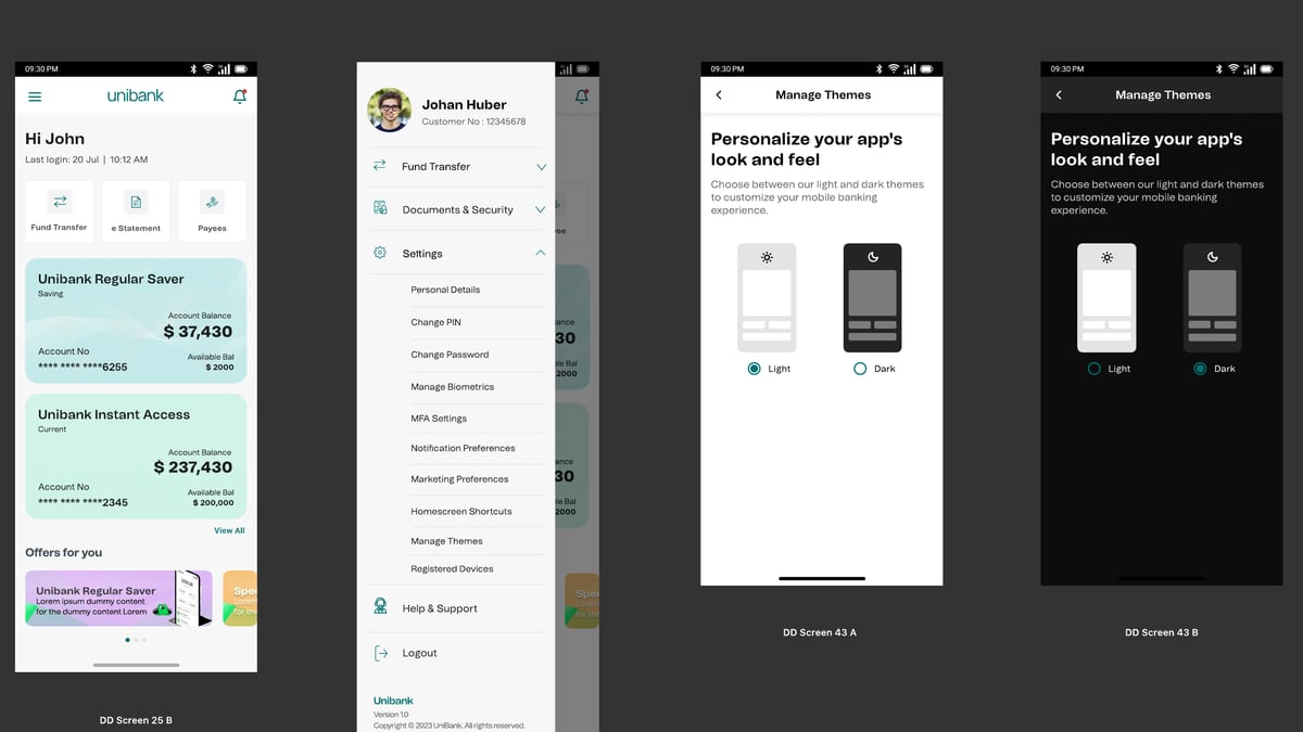
Unisys Digital Banking needed a modern experience on web and mobile, without disrupting the customers who rely on it every day. The screens shown here use Unibank, the product’s demo brand.
My role
Lead User Experience Designer in a team of seven. I worked from kickoff with stakeholders, business analysts and architects through to developer handoff, and built custom React Native components myself.
Who we designed for
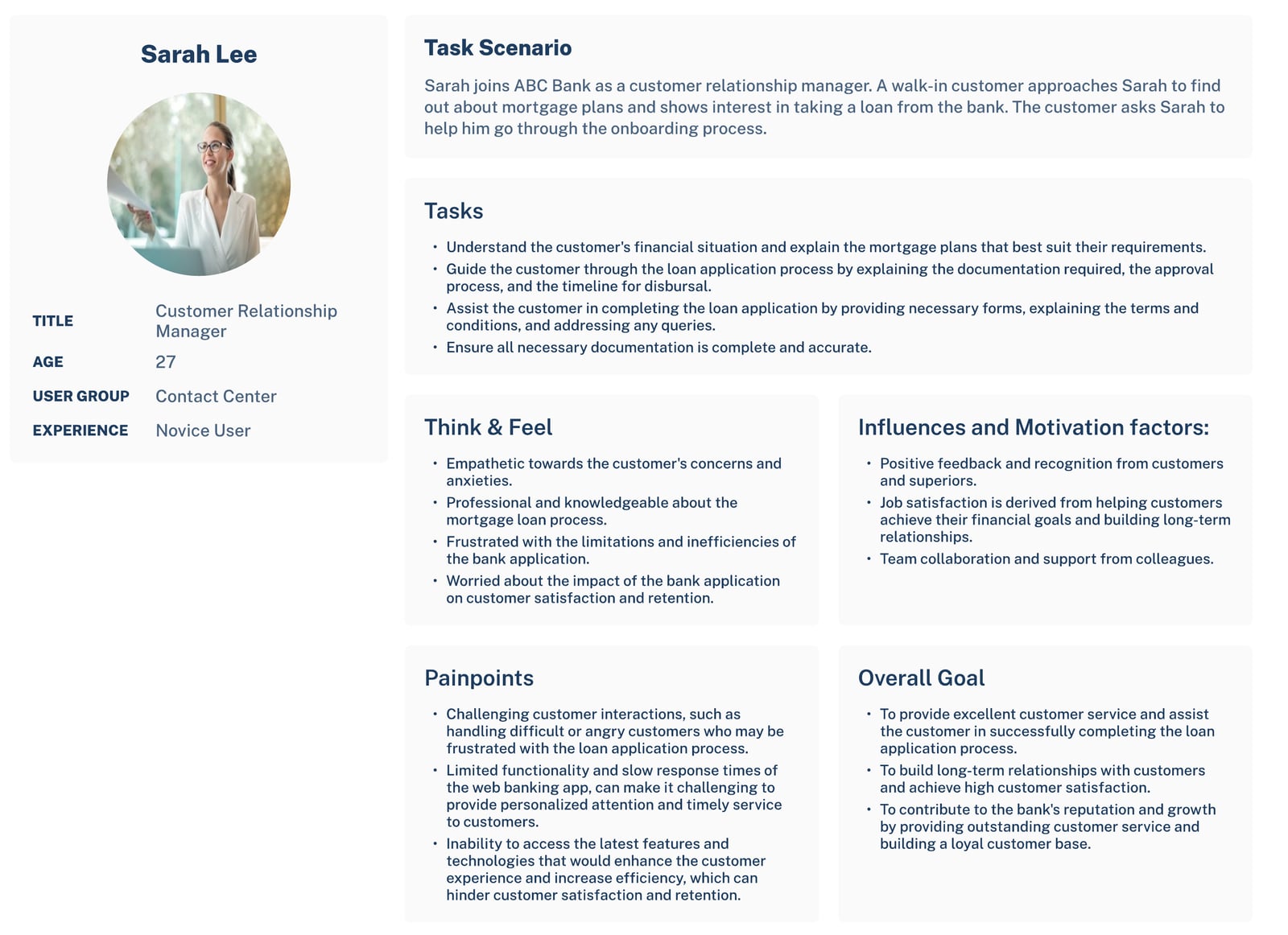
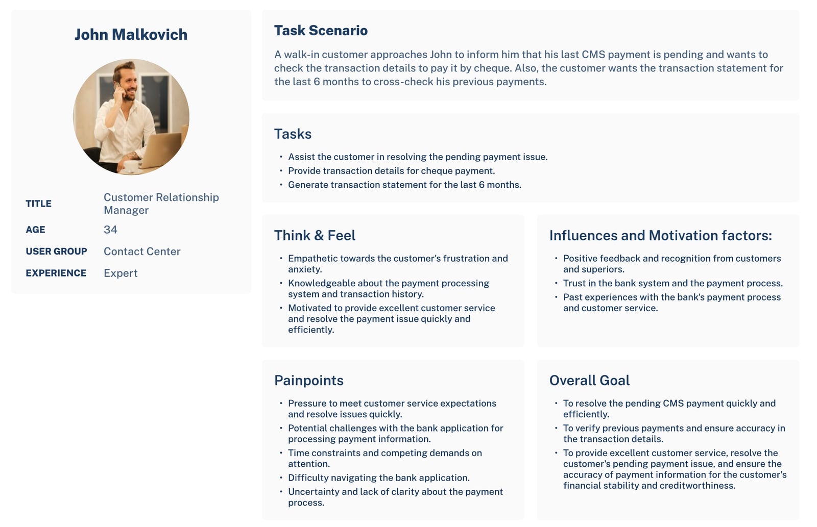
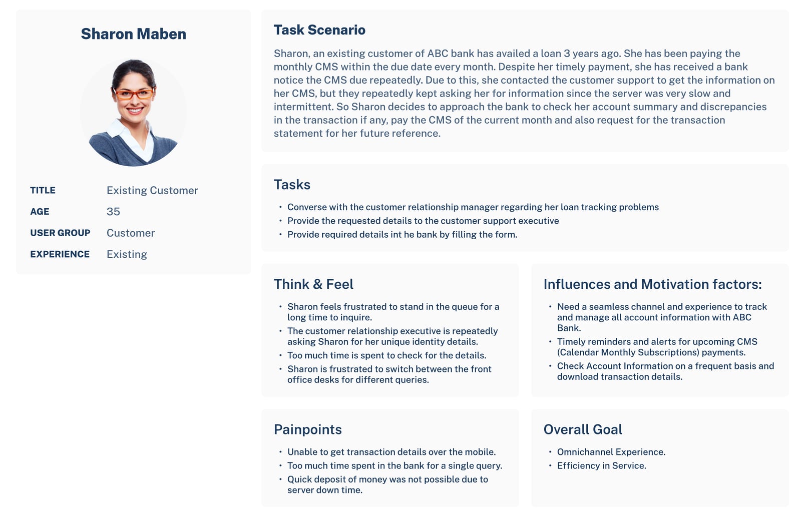
Three personas, each with an empathy map, covered both sides of the bank counter.
Sarah Lee is a new relationship manager. A walk-in customer wants a mortgage, and her slow, limited banking app keeps getting in the way.
John Malkovich knows the system well. He’s chasing a pending payment and a six-month statement, but the app makes even simple lookups hard.
Sharon Maben is a customer. She pays on time and still gets overdue notices. Support keeps asking for her identity documents, and she can’t see her transactions on her phone.
Sharon’s frustration became the brief. Customers needed to check accounts, statements and reminders on their phone, securely, without proving who they are again and again.
Mapping the service
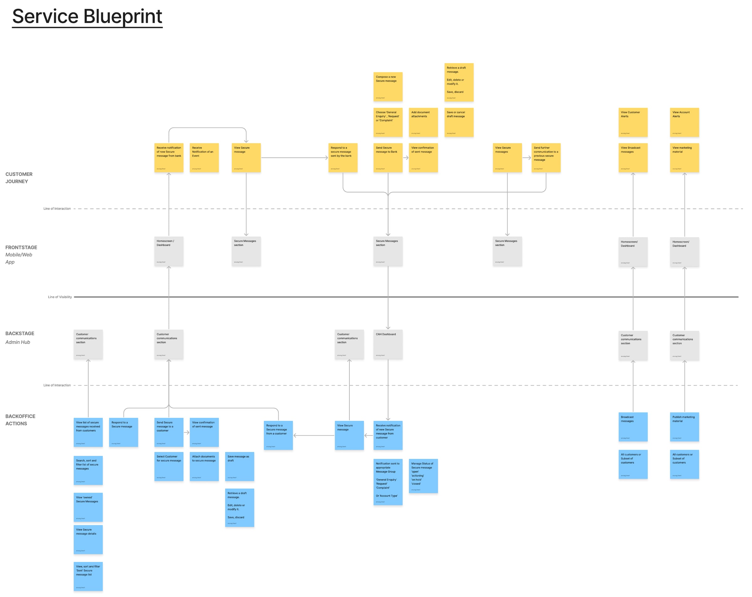
A banking app is only the visible part. I drew a service blueprint linking each customer action to the app, the staff admin hub and the back office. Secure messages, for example, get routed to the right team and tracked from open to closed. Alerts and offers go out to chosen groups of customers. Mapping both sides early meant no feature launched without the support behind it.
What I did
I analysed more than 1,000 user interactions and checked every fix with usability testing. Personas, task flows and wireflows came before any visual design. I defined the navigation and interaction patterns, contributed to the design system, and tested against the Web Content Accessibility Guidelines, the Americans with Disabilities Act and Section 508.
To stop quality leaking between design and build, I wrote custom components in the Reusable UI Framework Library.
Selected features
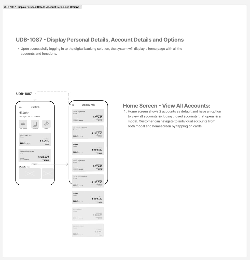
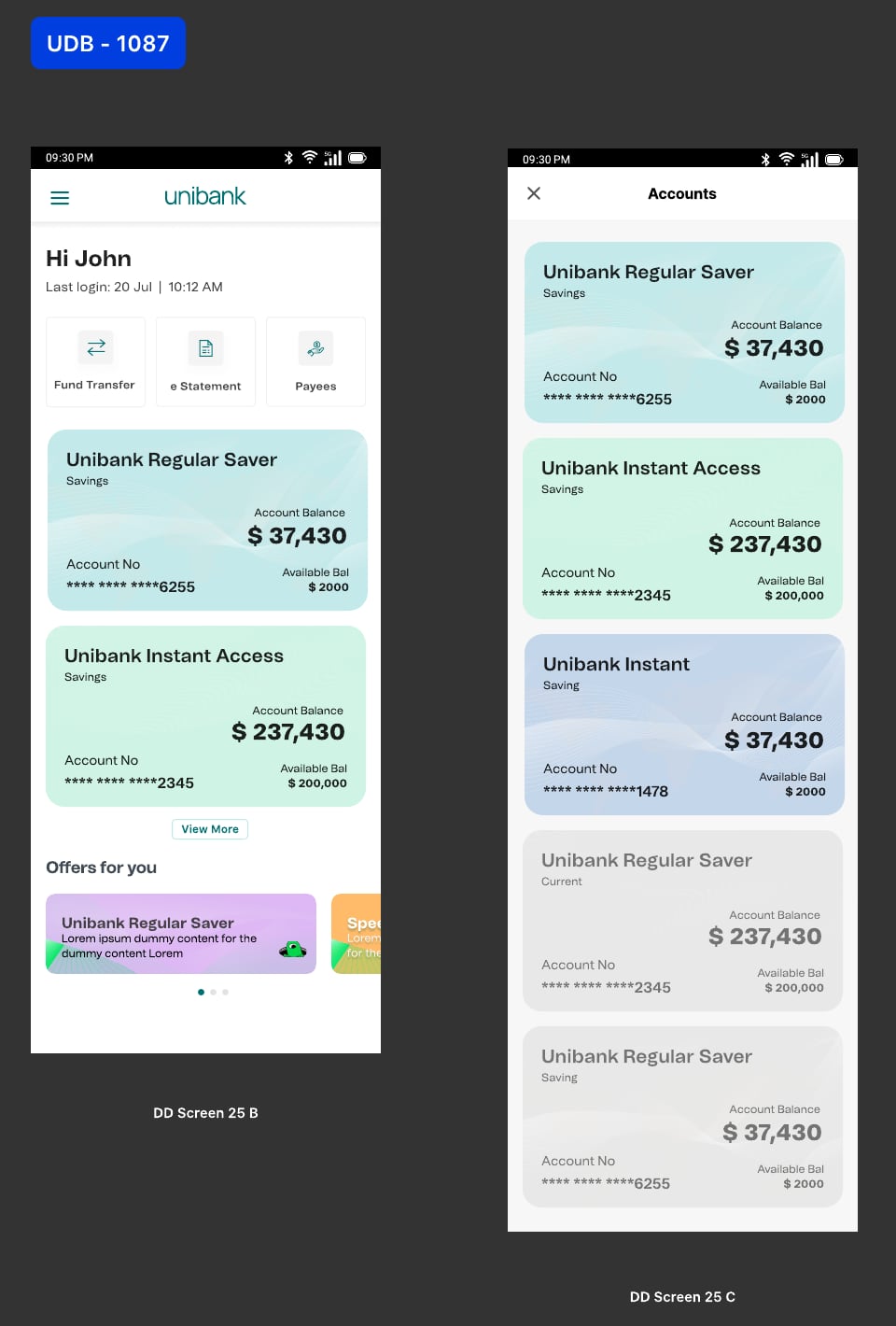
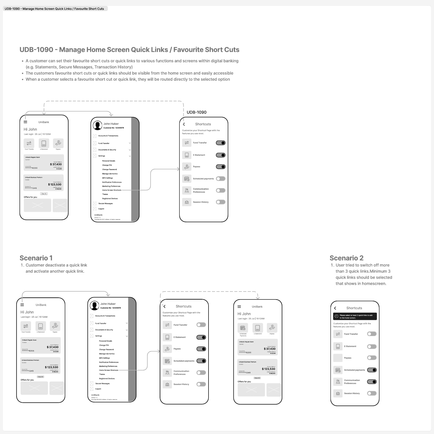
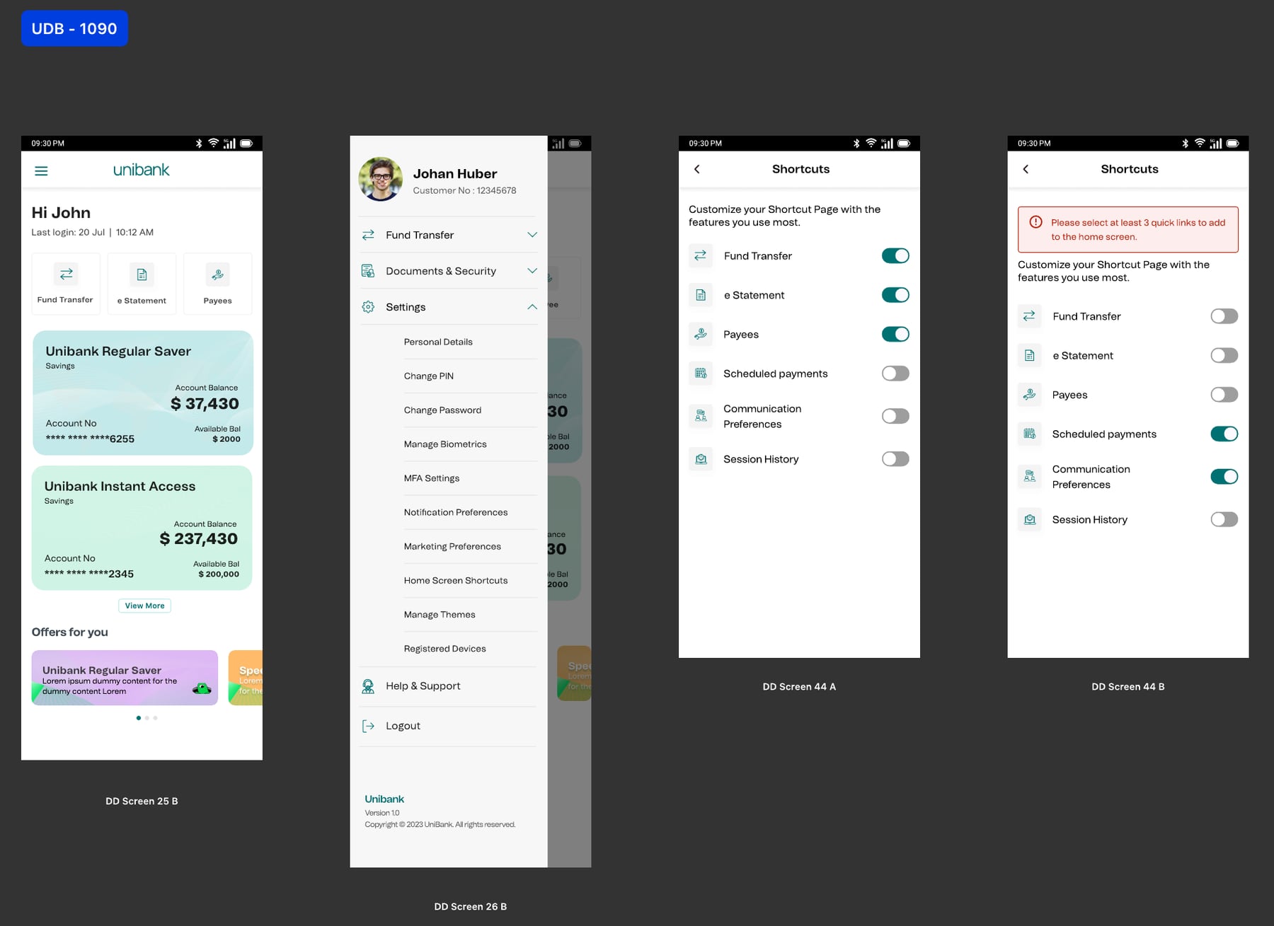
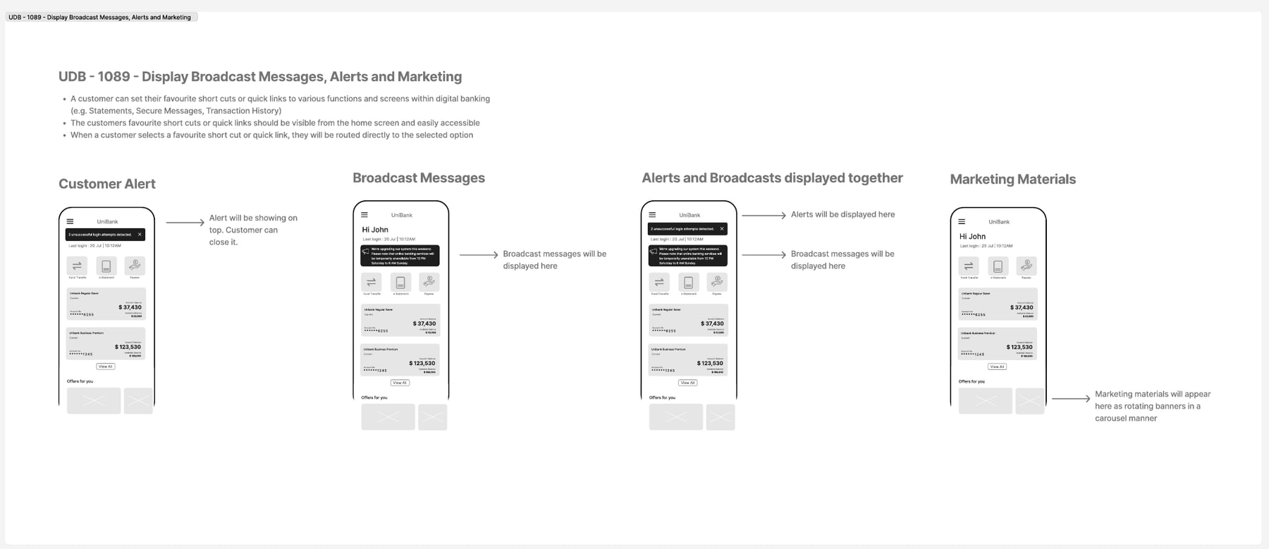
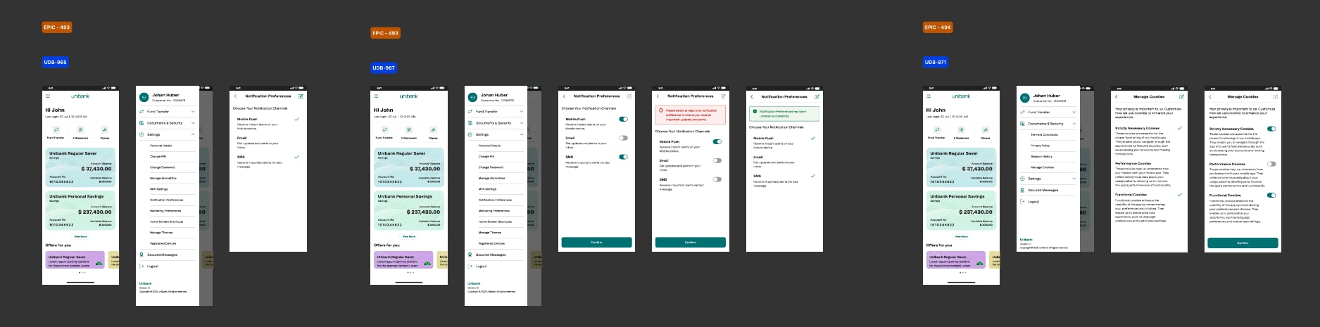
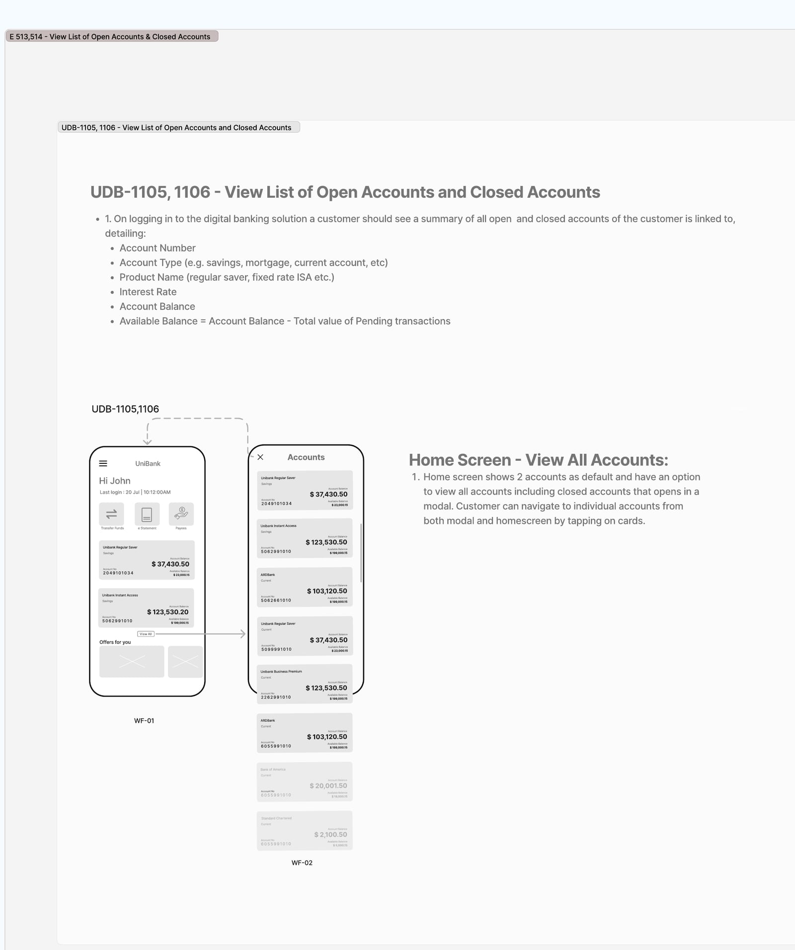
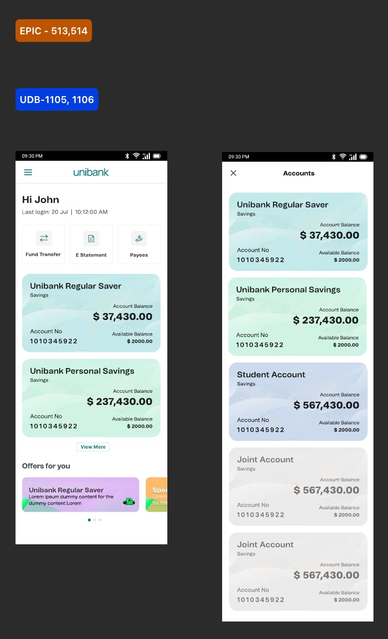
Home screen. Accounts at a glance. Customers pick their own quick links, with a minimum of three. Alerts, bank-wide messages and offers sit on one screen without competing.
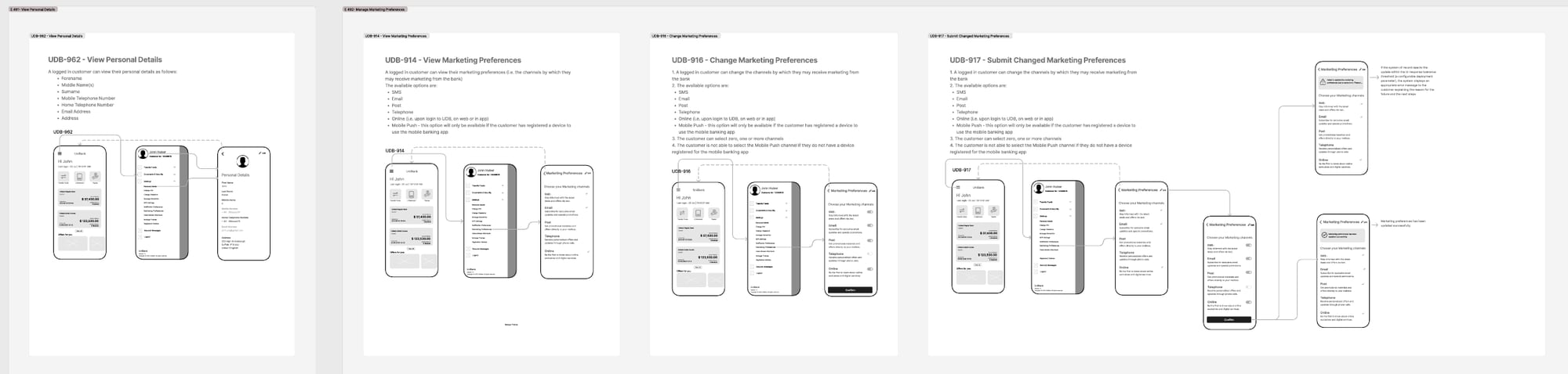
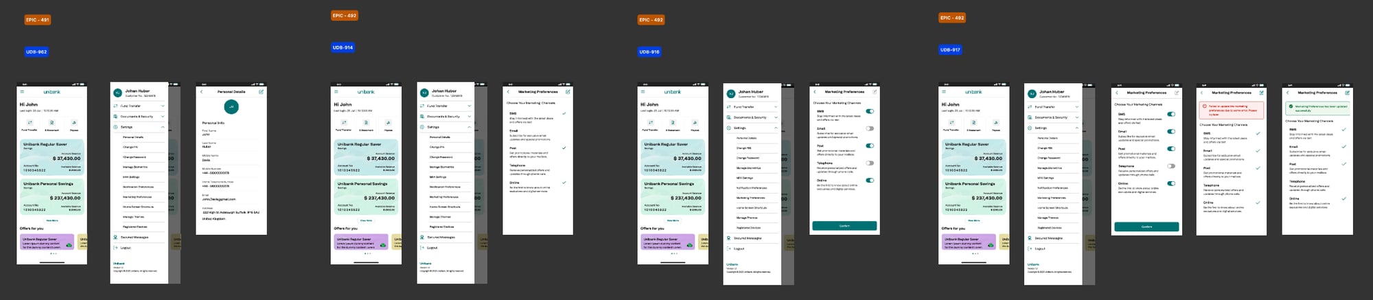
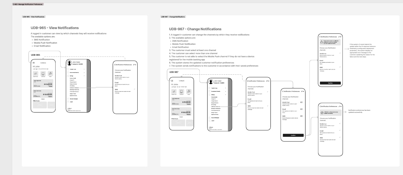
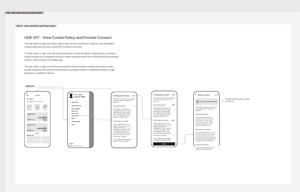
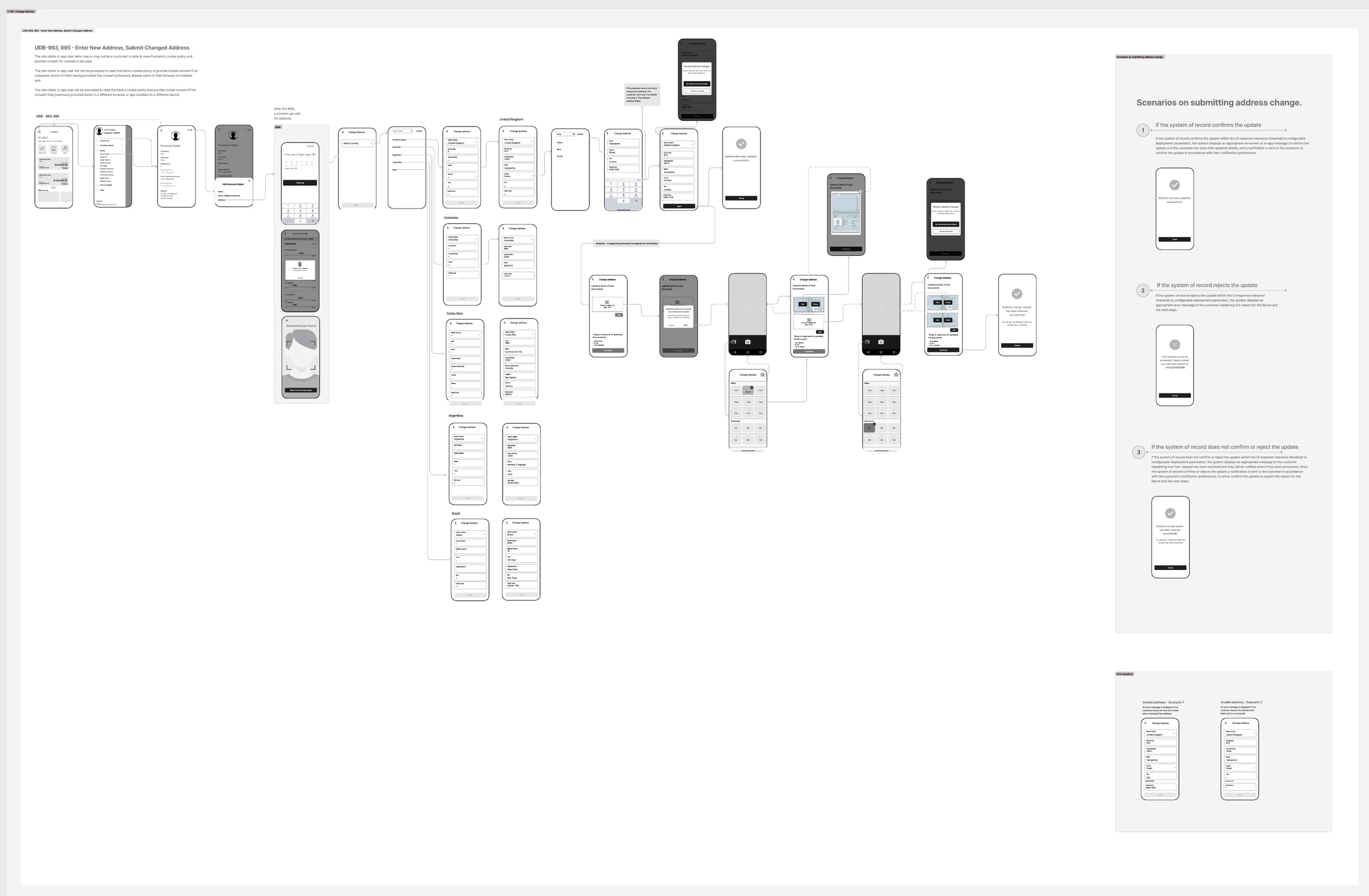
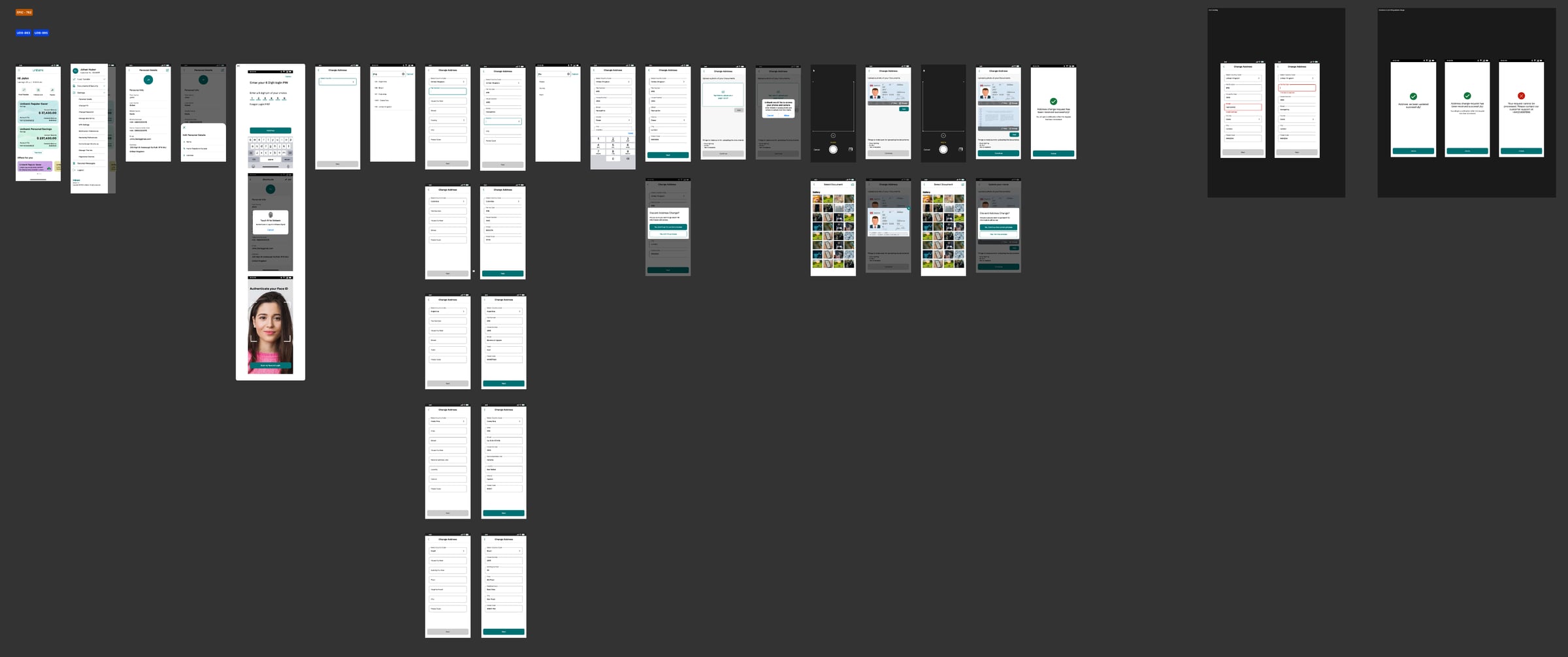
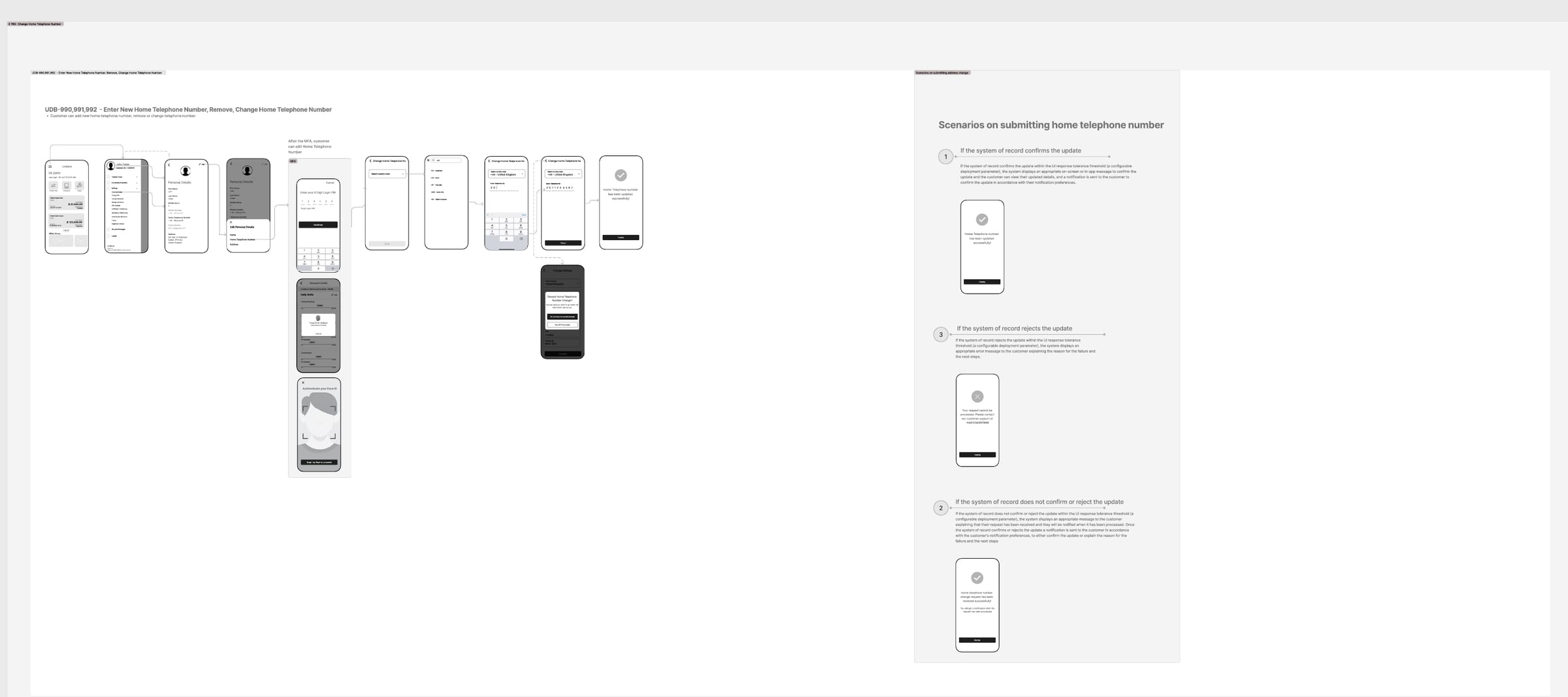
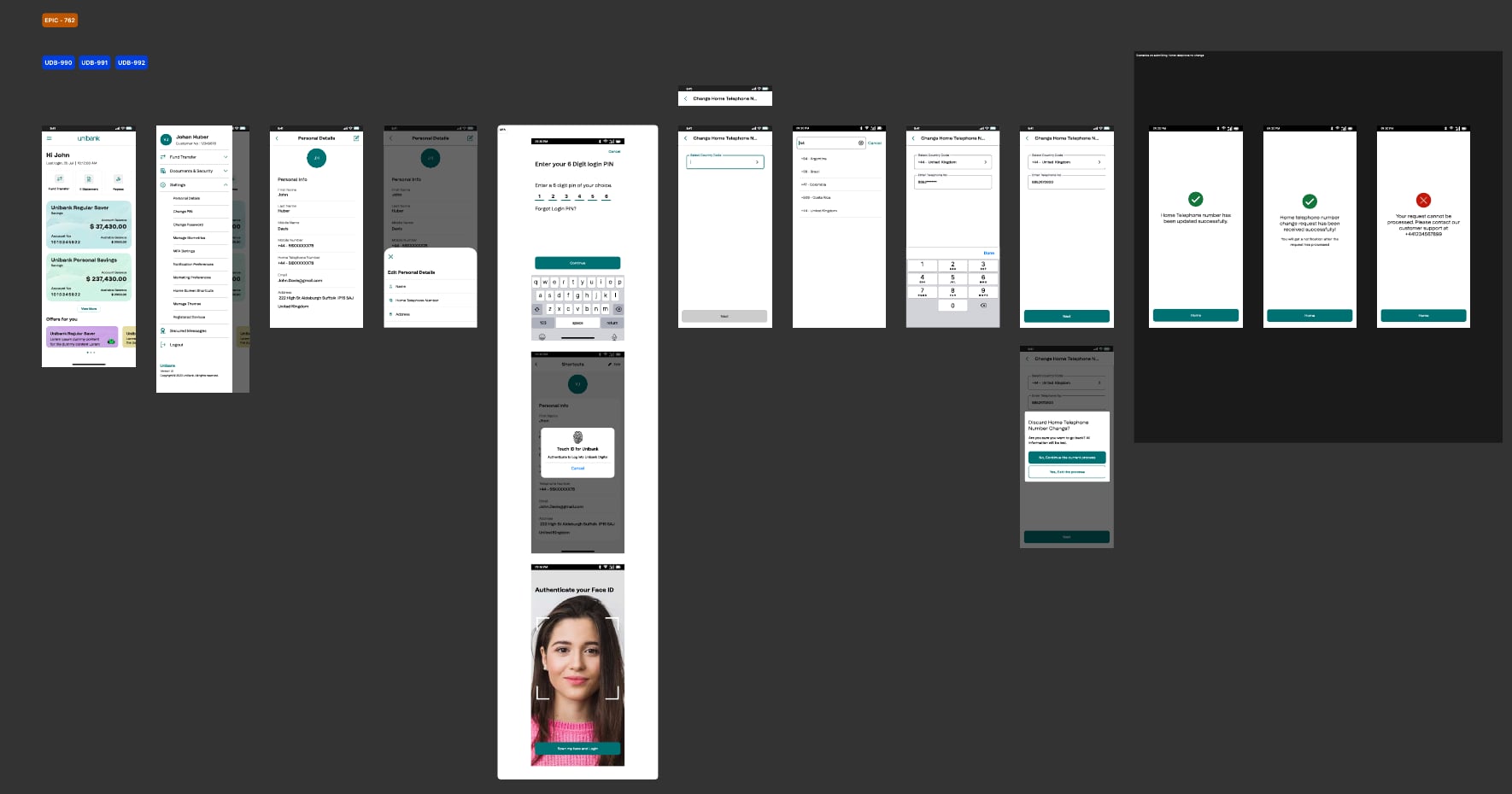
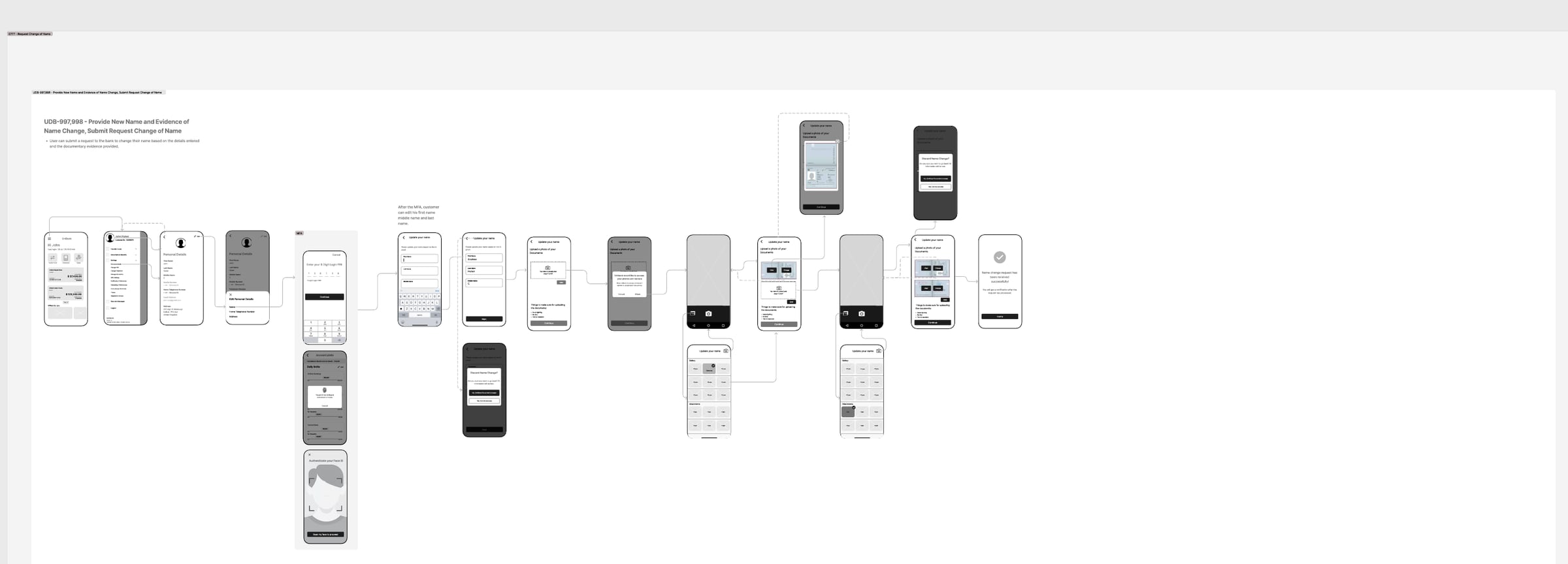
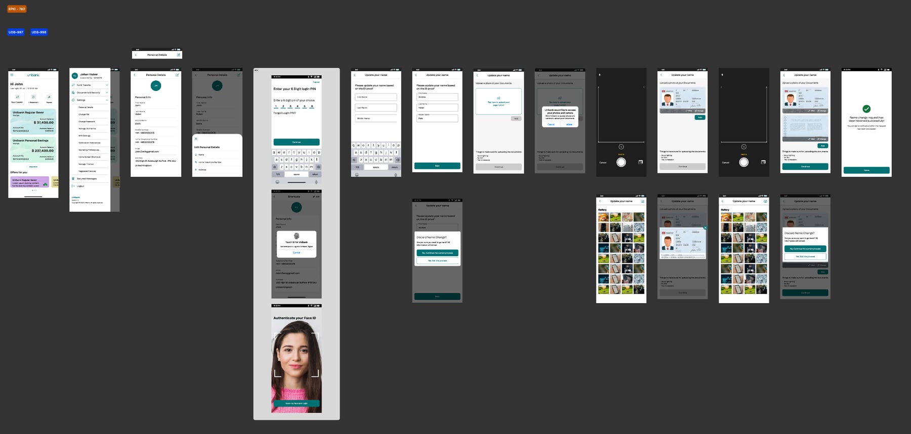
Customer data. Personal details, marketing and notification preferences, cookie consent, and changes to address, phone and name. The bank’s records system has the final say, so every change handles three outcomes: confirmed, rejected with next steps, or received and confirmed later.
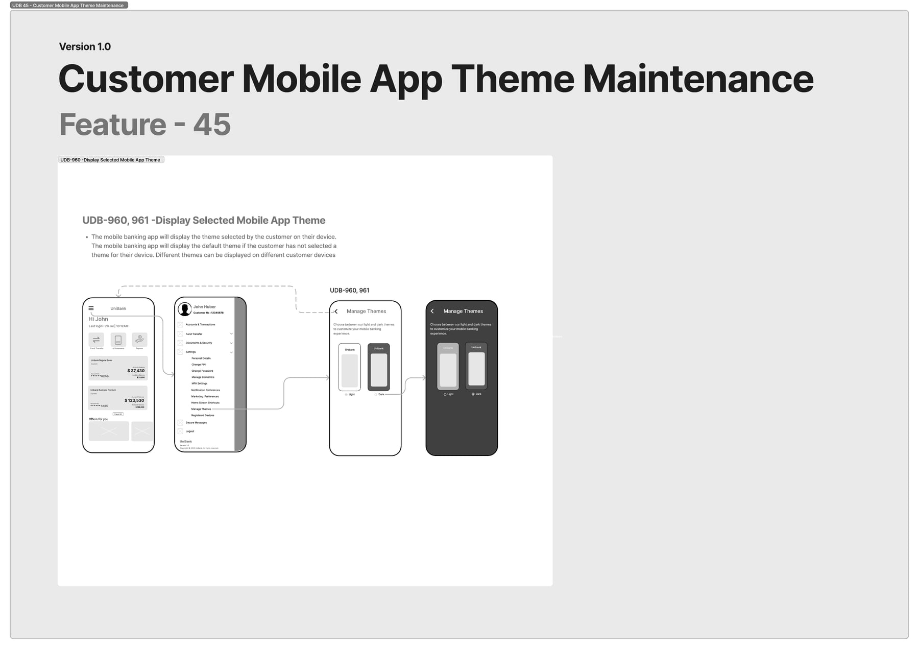
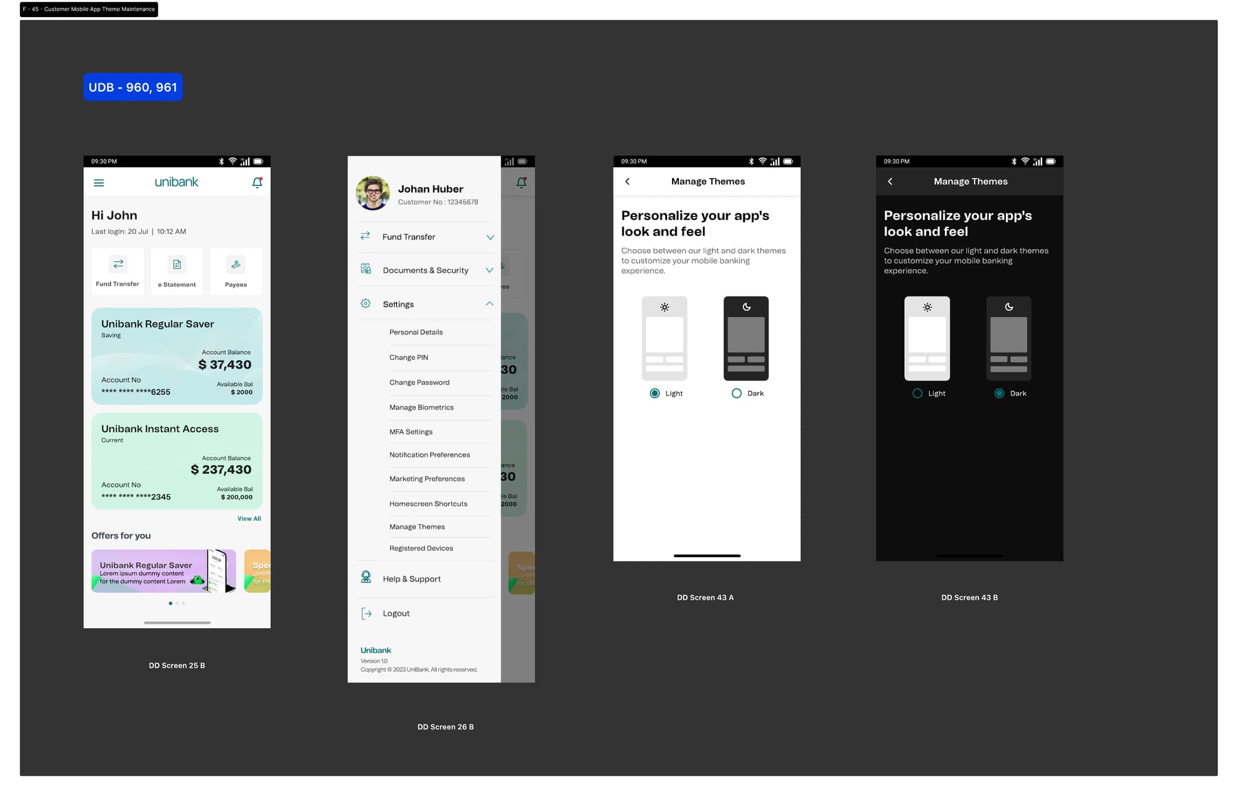
App theme. Light or dark, remembered per device.
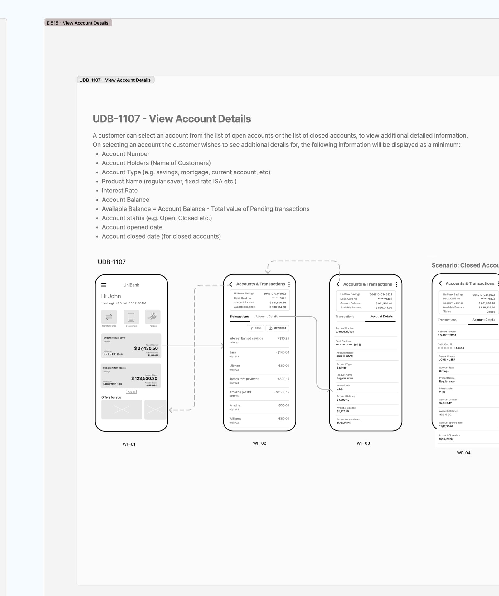
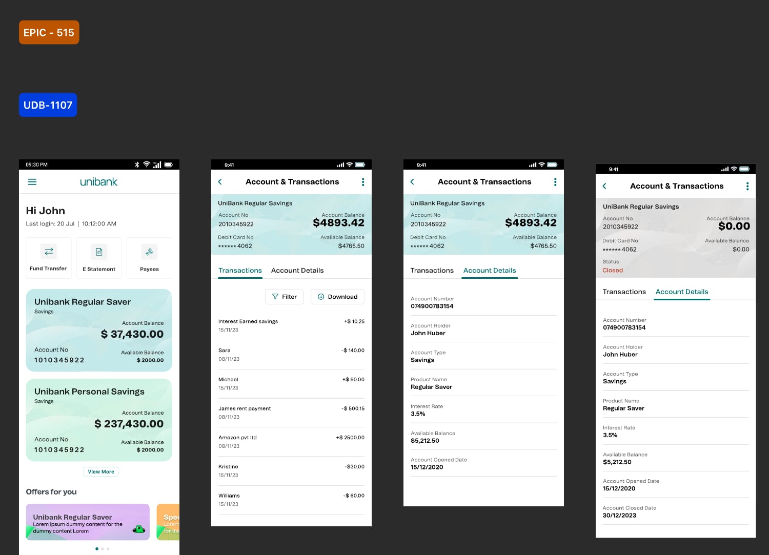
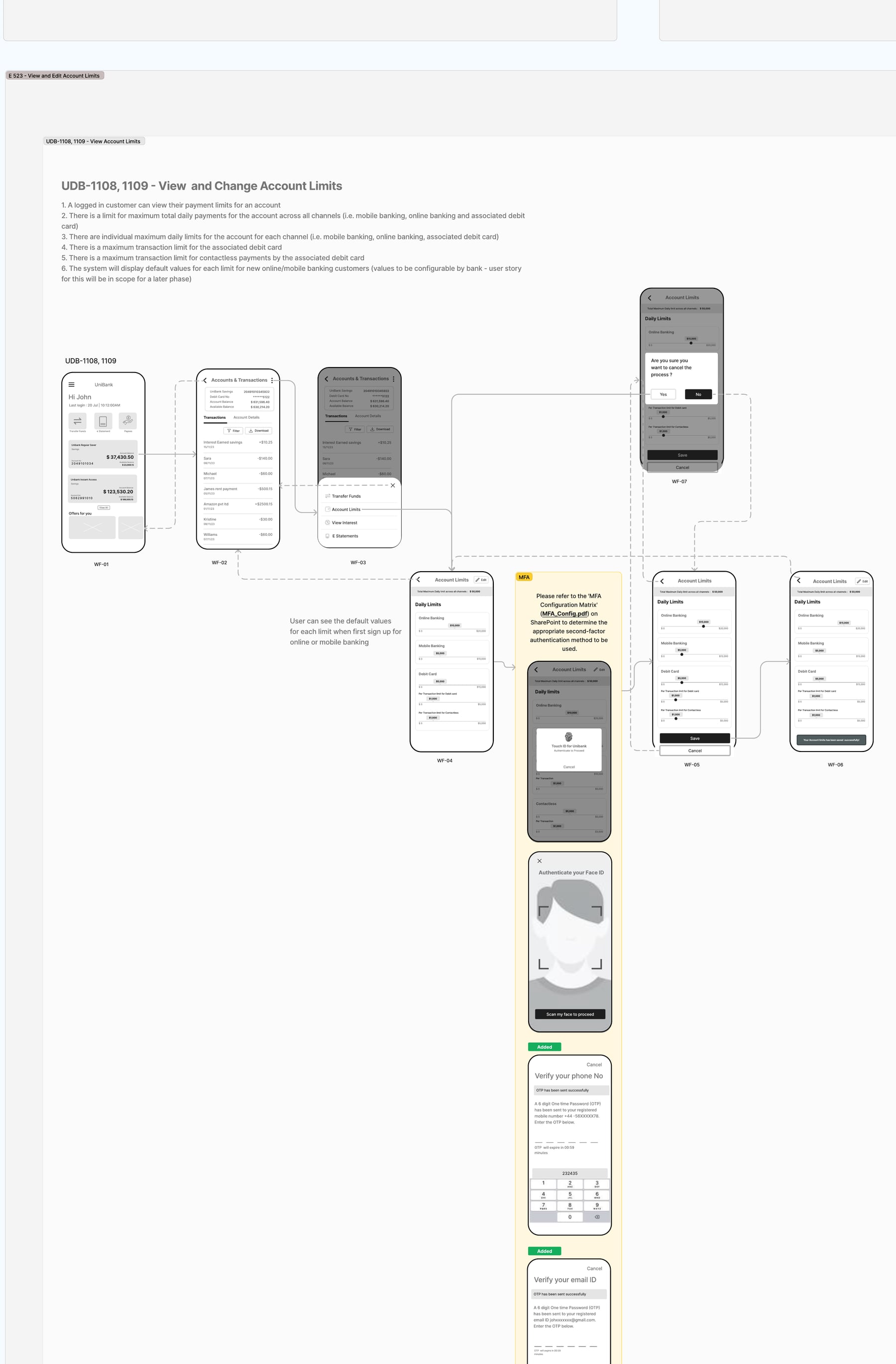
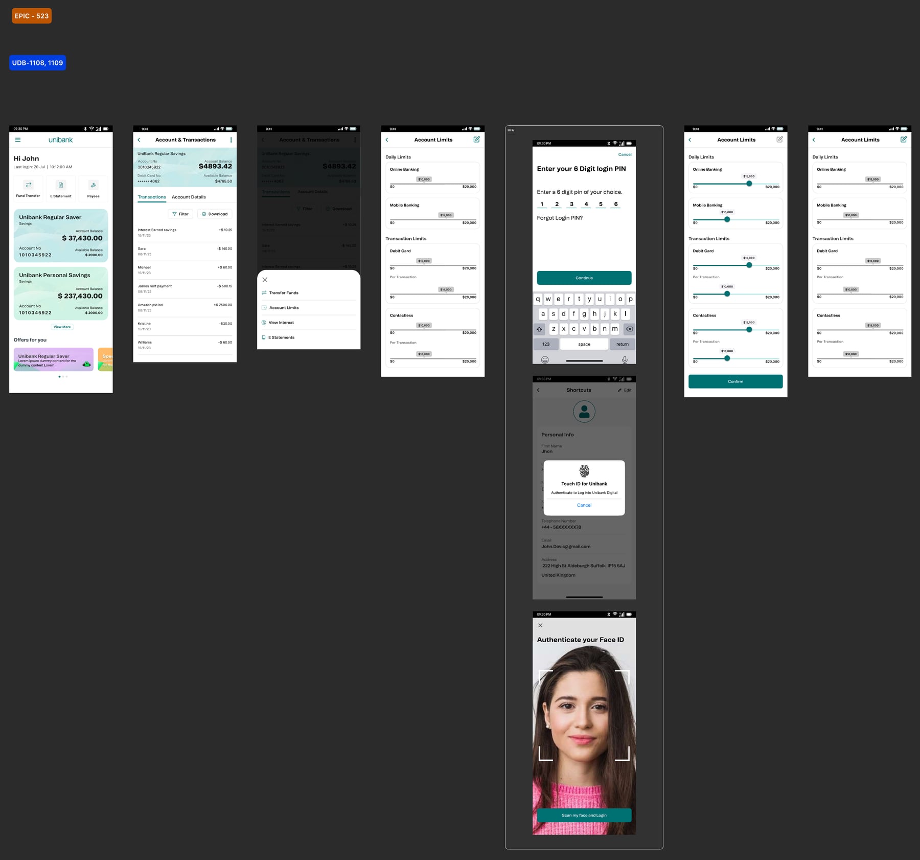
Account details. Open and closed accounts, full details, and payment limits. Changing a limit needs a personal identification number, Touch ID, Face ID or a one-time code.
Outcome
Engagement rose by about 40%. System errors fell by about 30%, and delivery got faster.
Personas, service blueprint and feature designs
Select any image to open it full size.