Itilite Brand Guidelines & Design System
Itilite's first brand guidelines. Logo, type, colour, icons and imagery that made product and marketing look like one company.
Context
Itilite is a corporate travel booking platform. Without shared rules, teams kept rebuilding the same patterns, and the product and the marketing looked like two different companies.
My role
I created the company’s first brand guidelines and design system. The guiding idea fitted on one line: consistency is key.
What I did
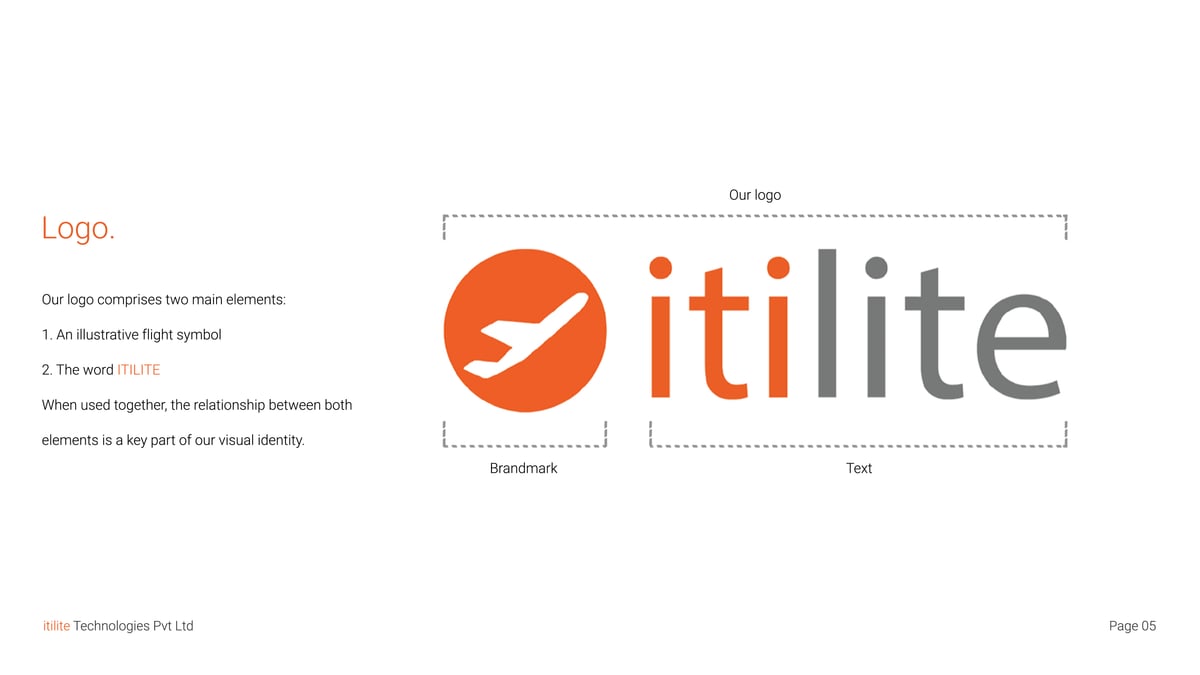
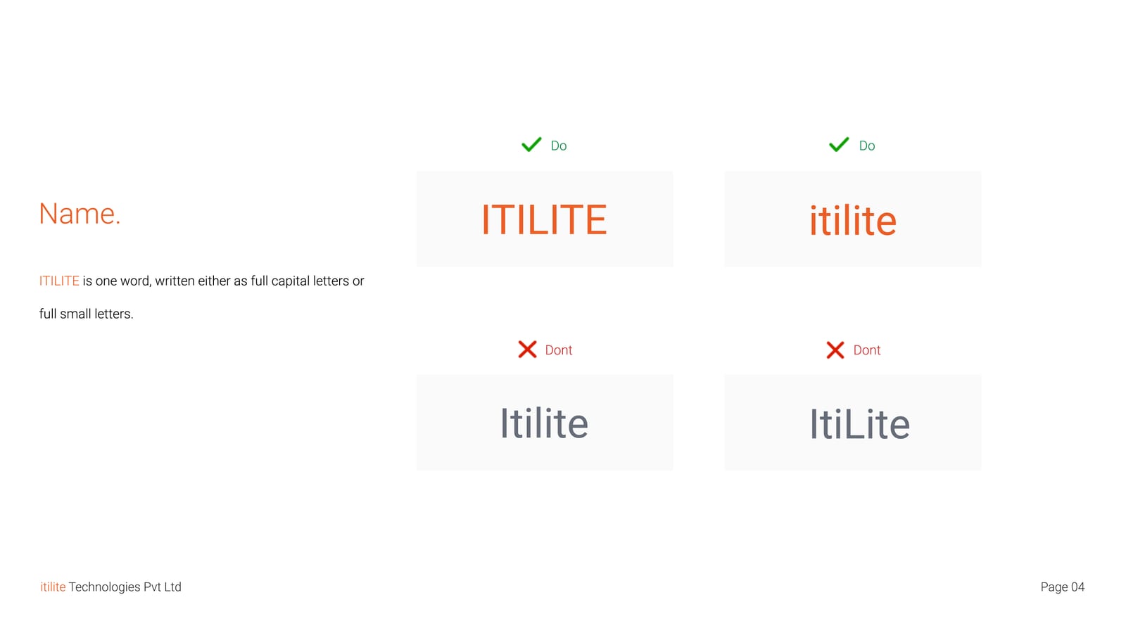
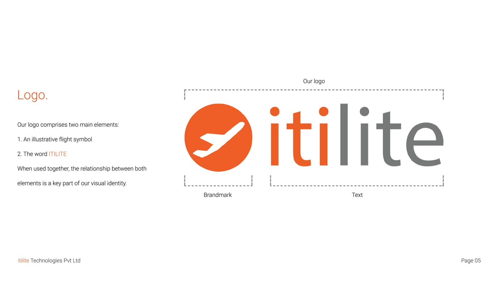
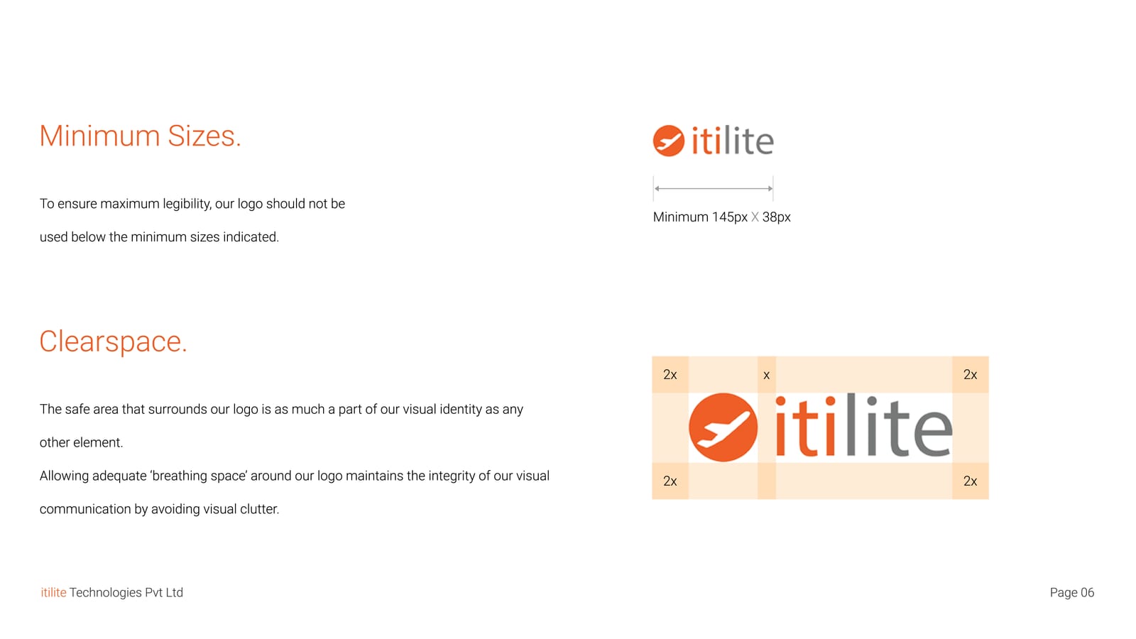
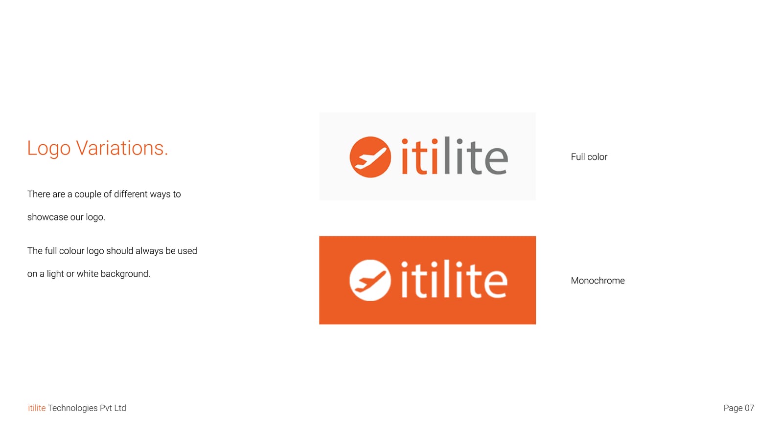
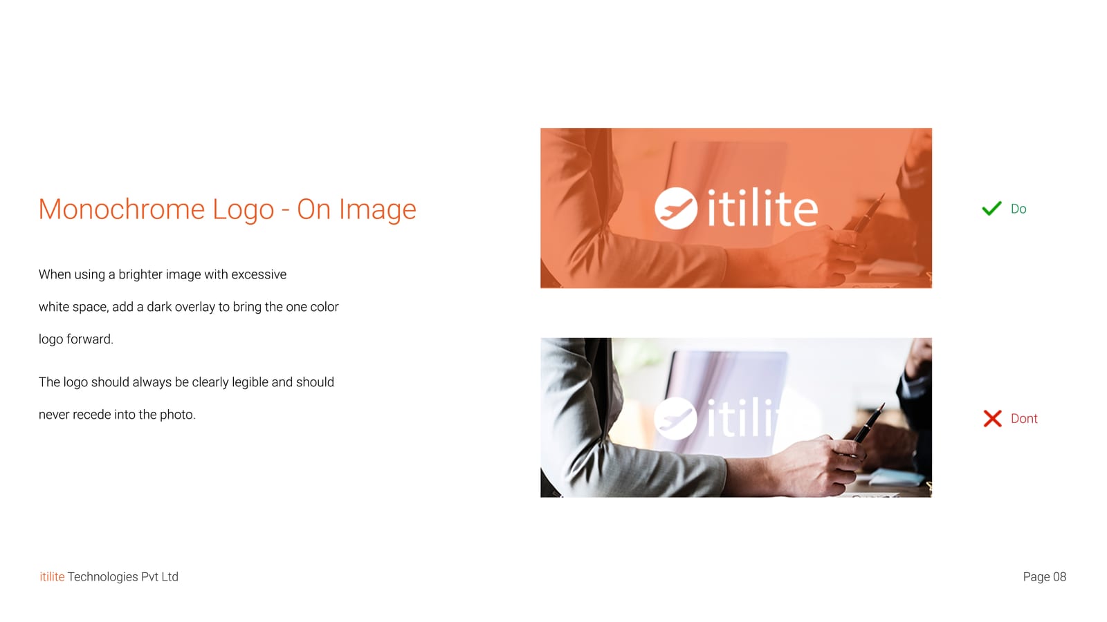
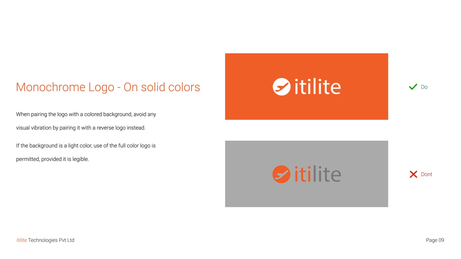
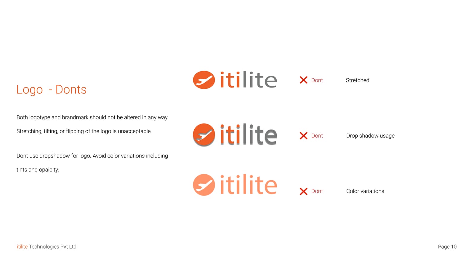
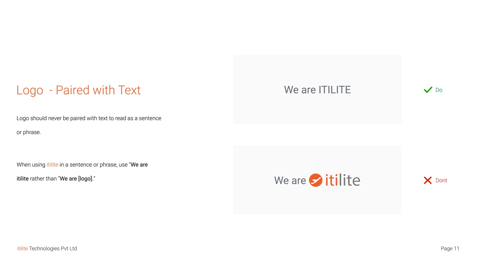
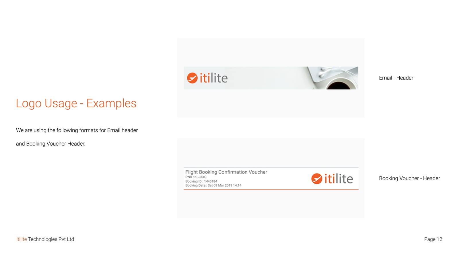
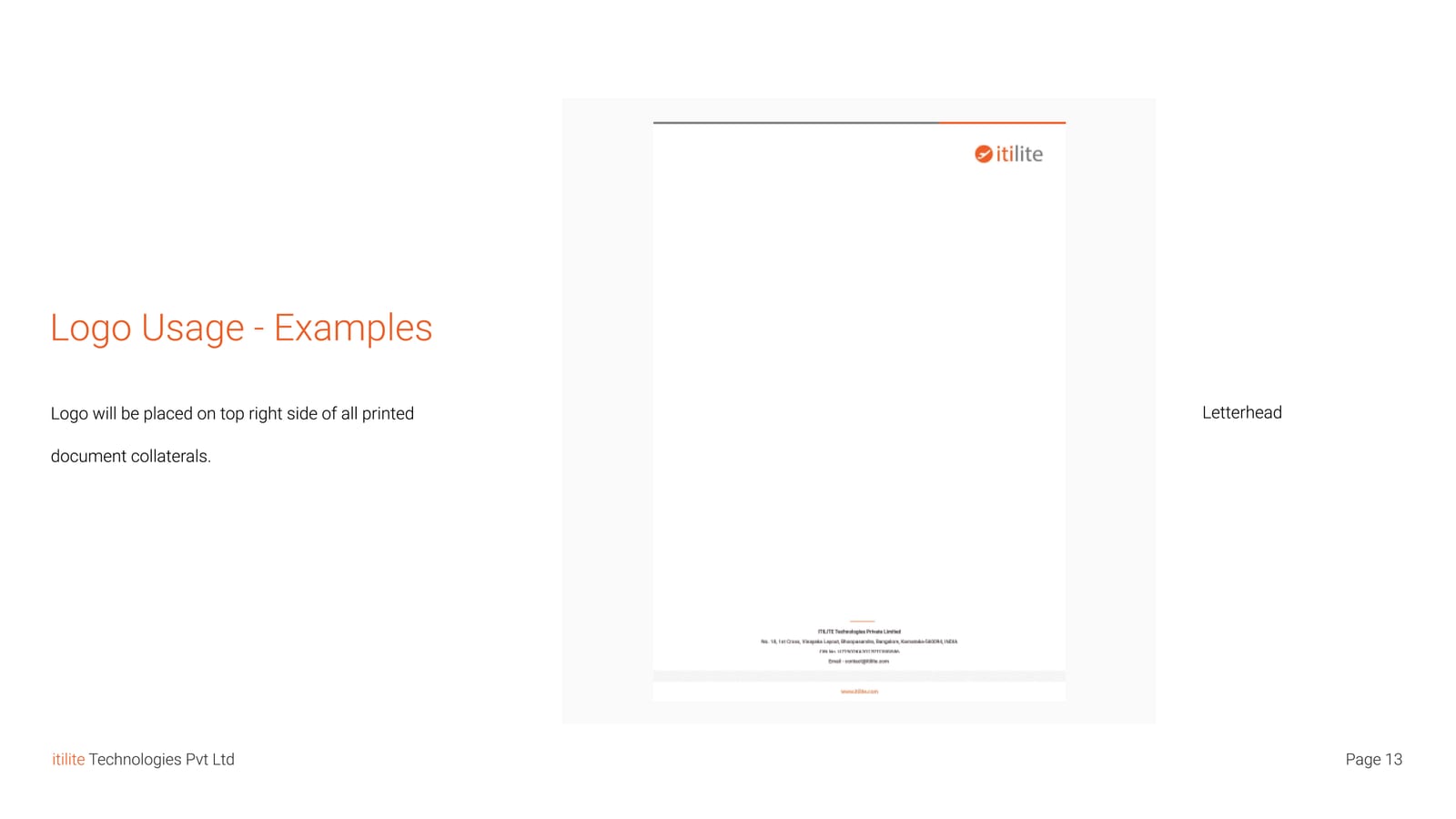
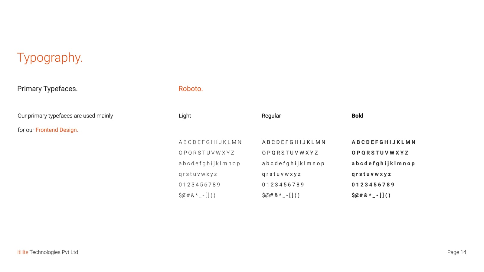
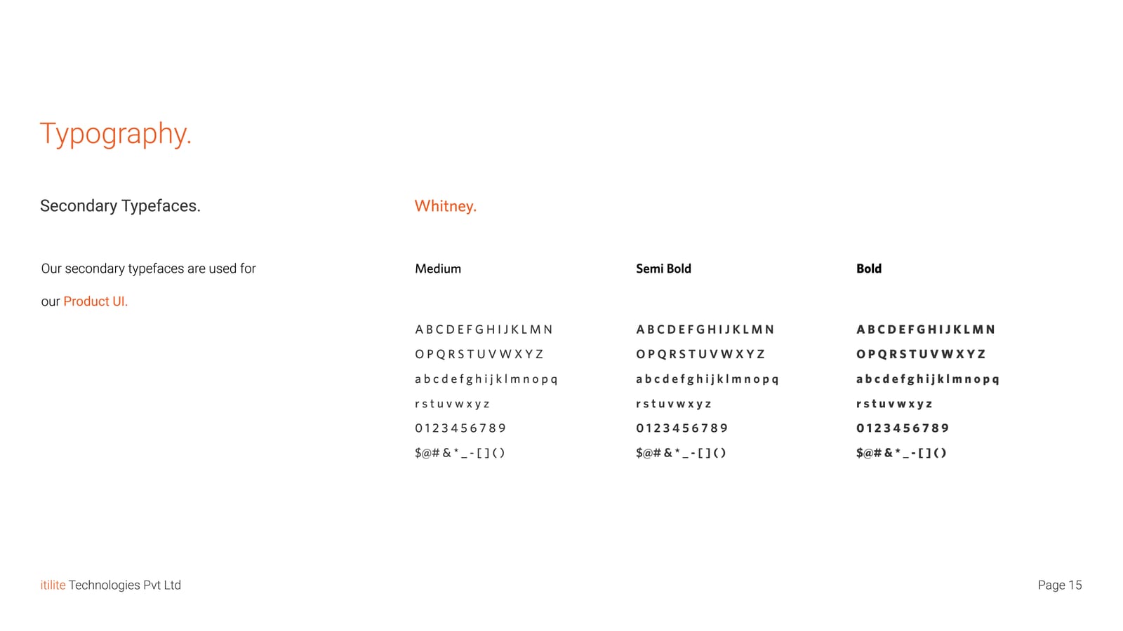
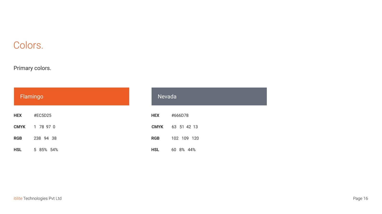
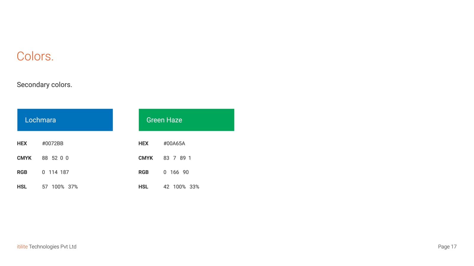
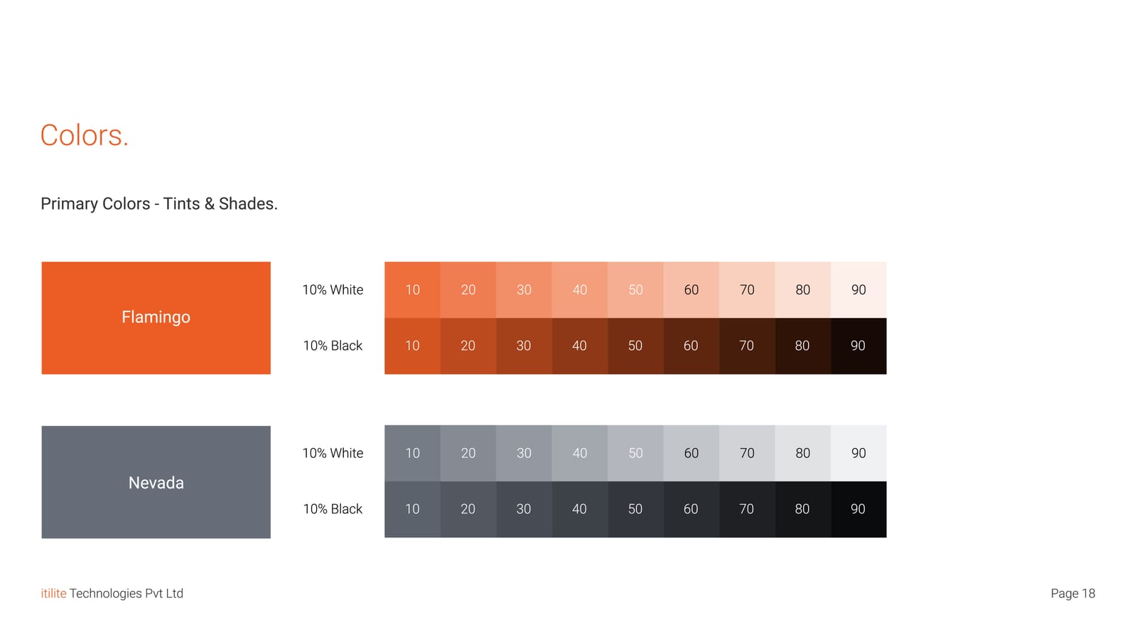
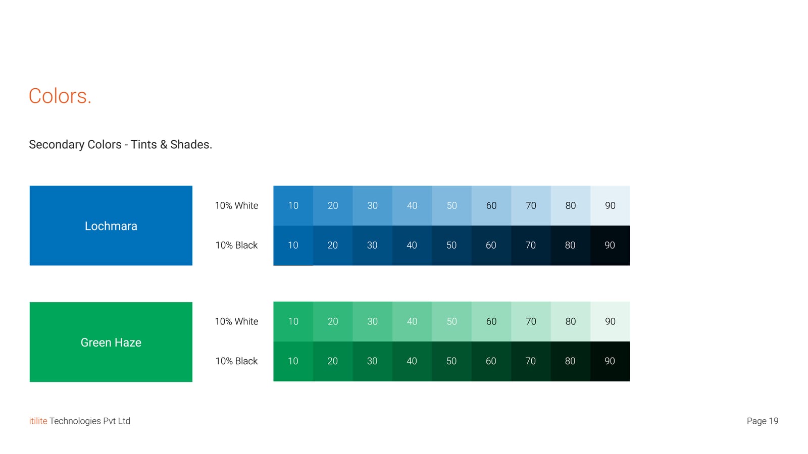
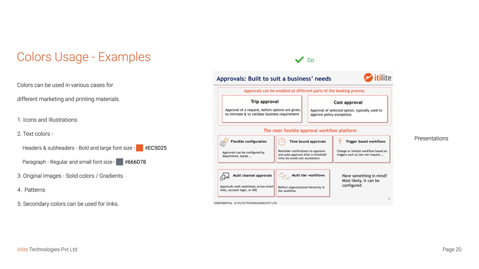
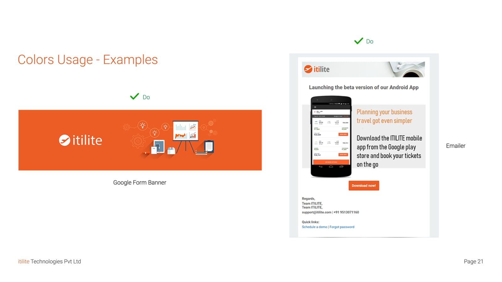
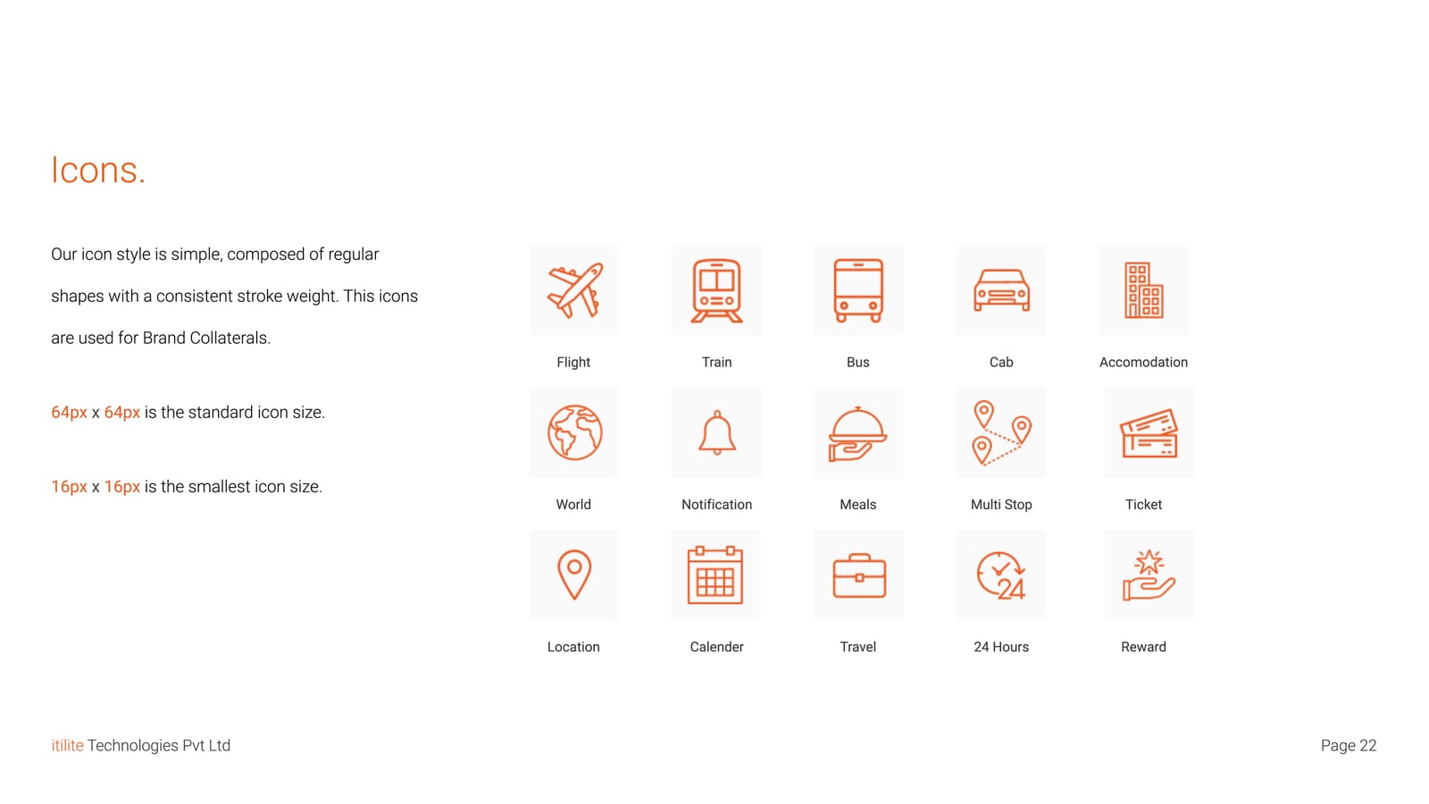
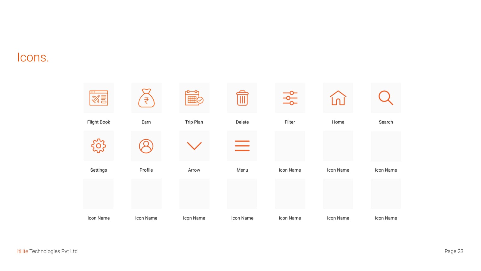
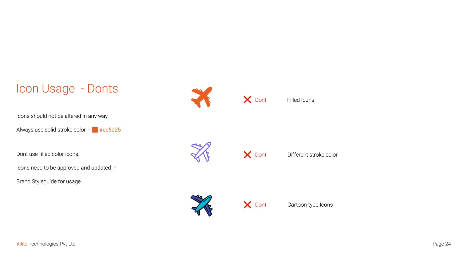
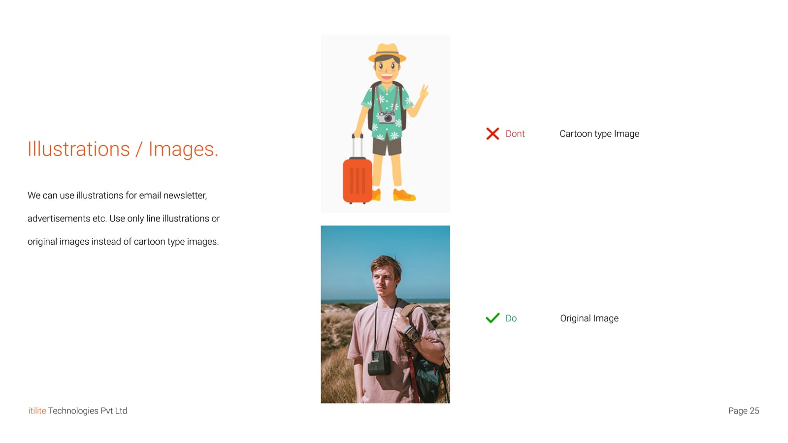
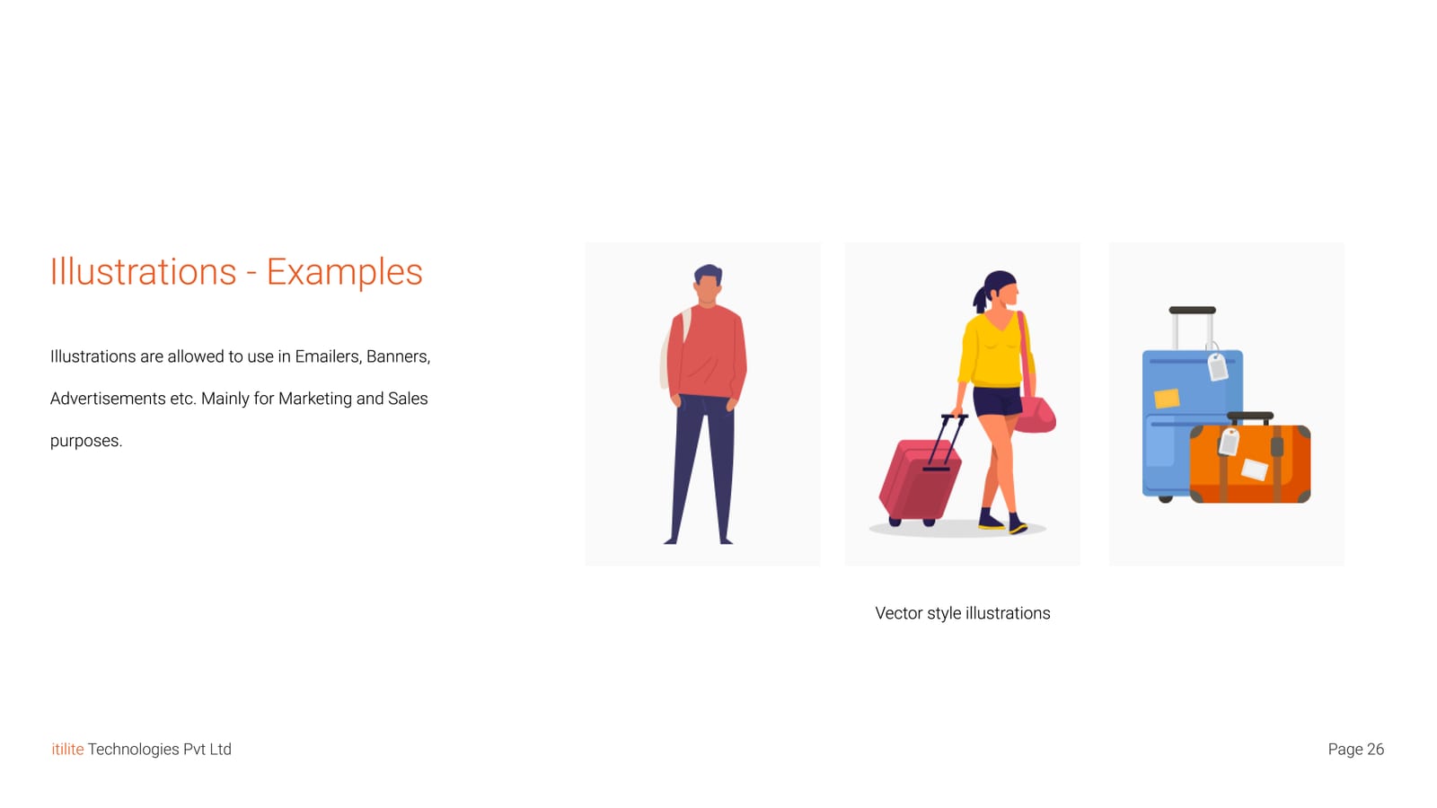
The guidelines cover how the logo is used, sized and coloured, with real examples. Roboto and Whitney handle typography. Four core colours each get a full scale of tints. A single icon set covers travel and interface needs, alongside clear rules for photography and illustration.
Outcome
Teams stopped reinventing patterns and shipped faster. Customer satisfaction went up.
Brand guidelines
Select any image to open it full size.